Panacea
Overview
Born from nature, minimalism and mindfulness - Panacea is a diet and nutrition clinic in Rajkot. Drawing inspiration from the Greek oriign of its name, the visual identity of Panacea is inspired by a Mediterranean aesthetic. We helped galvanise its story through a full-scope initiative including brand story, brand identity, brand language design, website and Instagram collaterals.
The color palette features a Byzantine Blue, reminiscent of the Mediterranean Sea, representing the clinic's commitment to holistic healing. Complementing it is a shade of Olive, derived from the lush olive groves that dot the Greek countryside. This color symbolizes the intrinsic connection between food and nature.
Panacea’s main logo icon showcases a delicately rendered lotus in a modern and abstract style representing growth and the unfolding of one’s journey towards better health. The primary typeface is clean, sans-serif, and legible, reflecting the clinic's commitment to clarity and expertise.
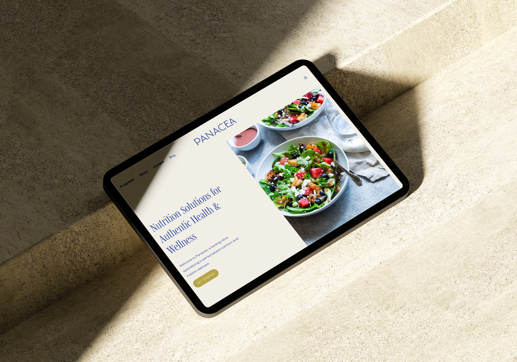
Bringing it all together is an immersive web experience that aspires to convey the clinic’s core philosophy and programs allowing prospective clients to understand the value proposition and reach out.
Services
brand design
brand story
Website Design
copywriting
Instagram glow-up
“I am absolutely thrilled with the website designed by this talented young woman, Ms. Persis Shah. Her creative vision and attention to detail shine through every page. The site’s layout is user-friendly, making it easy for my clients to navigate and access information. She skilfully incorporated appealing visuals that beautifully compliment my brand. Working with her was a pleasure, as she communicated effectively, and understood my needs, bringing my ideas to life flawlessly. I highly recommend her services to anyone seeking a top-notch website that delivers exceptional results. ”


